Dashboard
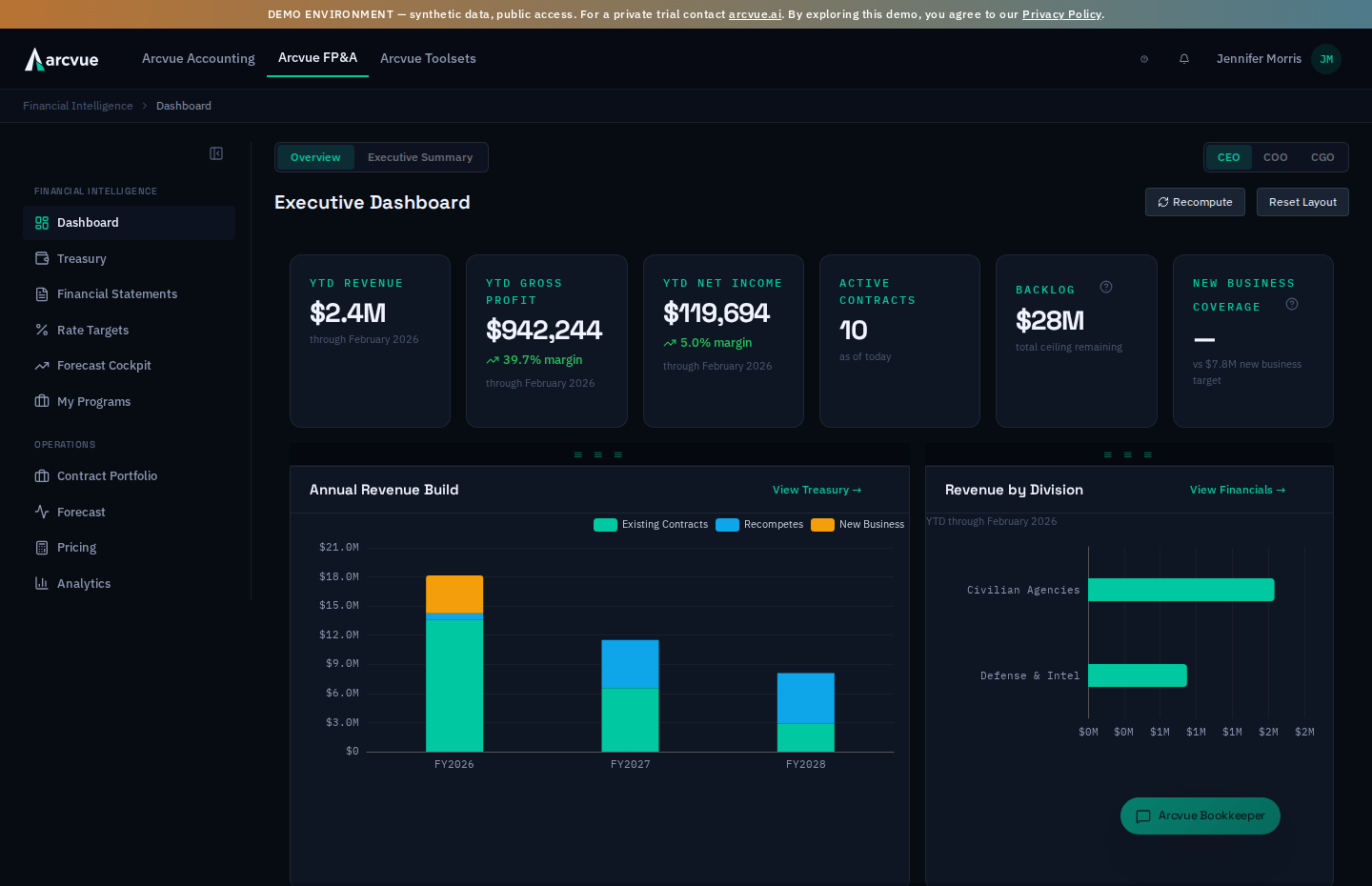
The Dashboard delivers a role-tailored view of your business health — KPIs, cash forecasts, revenue trends, and critical alerts — all in a drag-to-rearrange layout. Each executive role (CEO, COO, CGO, or Division Lead) sees a customized workspace built for their specific priorities.
How to access the Dashboard
-
In the left nav, open FP&A → Financial Intelligence → Dashboard
-
You'll land on your role's default view:
- CEO/CFO: See
Executive Dashboardwith KPIs, cash forecast, revenue trend, and revenue gap analysis (all draggable and resizable) - COO: See
Operations Dashboardwith active contracts, expiring contracts, forecast submission status, and division performance - CGO: See
Growth Dashboardwith pipeline KPIs, pipeline by division & stage, and top opportunities - Division Lead: See
My Programswith your active contracts and submission alerts (fixed layout, no role switcher)
Every other role is mapped to one of those four by what it is for, not by its name alone: company-wide finance and read roles (admin, finance lead, controller, staff bookkeeper, read-only, owner-executive, approver, FP&A analyst, external auditor) land on the Executive view; operations and contracts roles on Operations; growth, BD and capture roles on Growth; functional leads on My Programs. A role the mapping does not recognize lands on My Programs — the narrowest view — rather than falling open to the company-wide one.
- CEO/CFO: See
Layout & customization
Drag and resize widgets
- Hover over any chart widget to see the drag handle (three-line icon) at the top
- Click and hold the drag handle to move the widget to a new position on the grid
- Drag any widget edge or corner to resize it — minimum sizes are enforced per widget
- Your layout is saved automatically to your local browser and the backend
Switch between Overview and Executive Summary
- At the top of the page, find
Overview— charts, KPIs and interactives, and the default view for everyone Executive Summary= AI-powered briefing of key business health signals. This second tab appears only for theCEO,adminandfinance_leadroles. If you do not see it, that is the permission model working, not a fault — every role can reach the Dashboard page, but the briefing is restricted- Your tab choice is remembered across sessions
CEO/CFO only: Switch between role views
- At the top right, find the role switcher with buttons for
CEO,COO, andCGO - Click any button to view that role's dashboard instantly
- The Overview tab respects your role selection, and so does the Executive Summary tab for the roles that can see it
- Your role choice is remembered across sessions
Reset layout to defaults
- Click the
Reset Layoutbutton at the top right - All widgets return to their default positions and sizes
- Your dragging history is cleared; new changes are saved from that point forward
Table controls (sort, freeze, export)
Every dashboard table, in every role view, shares the platform's standard table behaviors: click a column header to sort (click again to reverse, a third time to clear), the header row stays frozen while the list scrolls inside its card, and the Export button downloads the table as a branded, print-ready Excel workbook stamped with your company name and the generation date.
When a widget cannot show its data
A widget whose data did not load says so in red ("The cash forecast could not be loaded.", for example), and one your role is refused says, beside a lock, that your role does not include it and to ask an administrator. Neither is an empty widget. The first is a request that failed, so reload the page; the second is a permission, so ask your administrator.
Quick Actions — the panel changes with your role
Quick Actions is a short list of destinations chosen for the role you are viewing as. Each row navigates; nothing on this panel changes data.
| Role | The actions offered |
|---|---|
| CEO | Review Treasury · Run Board Report · Check Covenants |
| COO | Review Expiring Contracts · Check Forecast Submissions · View Division Performance |
| CGO | Review Pipeline · Check Win Rates · View Top Opportunities |
| Division Lead | Enter My Forecasts · Review My Contracts |
A role the panel does not recognize is shown the CEO list, not an empty PANEL. That is worth knowing before you read the panel as evidence of what your role is: seeing the CEO's three actions means either you hold that role or the panel had no list for yours. The role switcher above it is the reliable answer to which view you are in; Quick Actions is not.
Where two rows look like they overlap, they do not. Review Pipeline and Check Win Rates both open the pipeline, but they are offered as separate entry points because they answer different questions once you are there. View Top Opportunities lands on the opportunities list itself rather than on NEO's home screen, so the list you were promised is the list you get.
CEO/CFO Executive Dashboard (Overview)
KPI Cards (top row — pinned)
Six metric cards show at a glance. Click any card to drill into details:
YTD Revenue: Year-to-date revenue vs. prior year (if 3+ months of actuals); click to open Financial StatementsYTD Gross Profit: Gross profit with margin %; click to open Financial StatementsYTD Net Income: Net income with margin %; displays only this KPI (no drill target)Active Contracts: Count of non-expired contracts; click to open Contract PortfolioBacklog: Total ceiling remaining across all contracts; click to open Contract PortfolioNew Business Coverage: Pipeline multiple vs. new business target; click to open Pipeline with coverage tab pre-selected
YTD figures read "through [Month] [Year]" when actuals data exists. Early in the fiscal year (fewer than 3 months), revenue comparison vs. prior year is hidden.
Cash Forecast (left chart, swappable)
Three options — click the gear icon in the header to switch:
-
13-Week Cash Forecast(default)- Charts weekly cash balance and minimum threshold
- Click a week's bar to open Treasury's Cash Walk on exactly that week (the URL carries the week number, so the link survives a bookmark or a paste); the
View Treasurylink opens Treasury's Summary - Shows
No cash forecastif Treasury is not configured
-
Annual Revenue Build(alternative)- Stacked bar chart: Existing Contracts, Recompetes, New Business by fiscal year
- Helps visualize revenue composition and growth sources
-
Debt Schedule Summary(alternative)- Card view: Total Outstanding, Annual Debt Service, Next Payment date/amount
- Lists each debt instrument with current balance
- Click
View Full Debt Schedule →to open Financial Statements
Revenue Trend (right chart, swappable)
Two to three options (the division view appears only if divisions are configured) — click the gear icon to switch:
-
Monthly Revenue Trend(default)- Line chart of revenue by month (current vs. prior year if available)
- Shows FY shorthand (e.g., "Mar '26") on x-axis
- Click
View Financialsto open Financial Statements
-
Revenue by Division(if divisions are configured)- Horizontal bar chart of YTD revenue per division
- Sorted by value; click a division bar to filter Contract Portfolio by that division
- Shows "YTD through [Month]" subtext above the chart
-
Revenue vs Prior Year(alternative)- Dual-line overlay: current year and prior year monthly revenue side-by-side
- Useful for spotting seasonal patterns and year-over-year changes
Revenue Gap Analysis (full-width bottom widget)
- Title:
Revenue Gap Analysis - Subheader: Displays fiscal year and
Actuals through [Month] - Interactive waterfall showing budget vs. forecast vs. actuals, with gap drivers
- Click
Reset Layoutif the chart disappears during resize (rare edge case)
Header controls (top right)
- Covenant warning indicator: Small dot (changes color if covenant early-warning triggered)
Budget Locked FY[YEAR](conditional): Appears for everyone when the budget is locked — it is why Recompute beside it is disabled. For roles that can open Forecast Assumptions (CEO, CFO, admin, finance lead, operations lead) it is a link that lands on that tab, where the lock is released; for every other role it is a plain chip whose tooltip says who can unlock it, rather than a click that quietly goes nowhere. A bookmarked link to the Assumptions tab from a role that cannot open it now shows that same message on arrival instead of silently landing on PortfolioRecomputebutton: Triggers a backend refresh of dashboard calculations- Button shows spinning icon and
Recomputing...while in flight - Clears after 3 seconds on completion
- Button shows spinning icon and
Reset Layoutbutton: Restores all widgets to default positions
If the page feels slow or charts aren't rendering, try clicking Recompute. This refreshes dashboard data from the database and can resolve stale or missing numbers.
COO Operations Dashboard (Overview)
KPI Cards (top row — pinned)
Four metric cards with alert badges:
Active Contracts: Count of non-expired PoP; click to open Contract PortfolioExpiring ≤6 Months: Count; red alert if > 0; click to open Contract Portfolio filtered to exactly the contracts counted — the count and the list are built from the same set, so they cannot disagreeForecast Not Submitted: Count; red alert if > 0; click to filter Forecast Cockpit by unsubmitted forecastsLow GP Margin: Count of contracts with GP below your configured threshold; red alert if > 0; click to open Contract Portfolio filtered to exactly those contracts
Revenue Gap Analysis (top widget, full-width)
- Title:
Revenue Gap Analysis - Division selector: Dropdown labeled
All Divisions(or individual division names)- Default shows all divisions combined
- Select a division to see that division's gap waterfall in isolation
- Subheader:
FY[YEAR] — Actuals through [Month] - Shows budget, forecast, and actuals with gap drivers
- Selector state is NOT saved across page reloads
Division Performance (bottom-left, table)
- Title:
Division Performance - Column headers:
Division,Revenue,Gross Profit,GP% - Click any row to navigate to Contract Portfolio filtered by that division
- Colors on GP%: red for negative margins, amber for thin margins (0% to below 15%); margins of 15% and above display in the standard text color
GP%shows—for a division with a contract that has revenue and no recorded cost: a margin is never computed from revenue alone, and blending that contract in would count its revenue against the others' cost. A division whose every contract carries cost keeps its figure- Shows pulsing placeholder rows while data fetches
Top 15 Contracts (bottom-right, table)
- Title:
Top 15 Contracts by Revenue - Column headers:
Contract,Division,YTD Revenue,GP%,PoP End - Sorted by YTD revenue (highest first)
- Click any row to open Forecast Cockpit with that contract pre-selected for edit
- GP% shows red when negative; non-negative margins display in the standard text color; a contract with revenue and no recorded cost shows
—rather than 100% - Shows pulsing placeholder rows while data fetches
CGO Growth Dashboard (Overview)
KPI Cards (top row — pinned)
Five metric cards:
Total Pipeline: Unweighted pipeline revenue time-phased into this fiscal year — not the lifetime value of every open pursuit. An opportunity starting in July contributes only its remaining months. Click to open PipelineWeighted Pipeline: the same in-year figure adjusted by each opportunity's pWin (read-only)New Business Coverage: Pipeline multiple vs. new business target- Delta badge: "Healthy" (≥3x), "Adequate" (1.5x–3x), or "At Risk" (<1.5x)
- Shows new business target in subtext if configured
Win Rate: Percentage (e.g., "42%")- Shows wins/losses in subtext (e.g., "12W / 15L")
- Delta badge: "Strong" (≥50%), "Average" (30–50%), or "Below Avg" (<30%)
Due This Month: Count of decisions pending this month; red alert if > 0; click to open Pipeline
Pipeline by Division (bottom-left chart)
- Title:
Pipeline by Division - Horizontal bar chart of annual revenue per division (from pipeline)
- Shows "No divisions configured" message if divisions are not enabled for your tenant
- Click a bar to navigate to Contract Portfolio filtered by that division
Pipeline by Stage (bottom-right chart)
- Title:
Pipeline by Stage - Horizontal bar chart of pipeline value per stage, color-coded by stage
- Tooltip shows stage name, dollar value, and opportunity count (e.g., "Proposal: $5.2M (8 opps)")
- Useful for identifying bottlenecks in your sales funnel
Top Opportunities by Weighted Value (full-width bottom widget)
- Title:
Top Opportunities by Weighted Value - Column headers:
Opportunity,Type,Stage,Annual Value,PWin,Weighted - Type badge: "Recompete" (blue), "New Business" (teal)
PWin= probability of win (percentage)- Click any row to open Pipeline with that opportunity pre-selected for search
- Shows
No pipeline opportunitiesif no data exists
Division Lead Dashboard (My Programs — fixed layout)
KPI Cards
Four metrics (no role switcher; fixed view):
My Active Contracts: Count of your division's non-expired PoPMy YTD Revenue: Division revenue YTD (click to open Contract Portfolio)My Average GP%: Average GP% across your active contracts- Shows
—if your division has no contracts, or if any of its contracts this year has revenue and no recorded cost - Delta badge: "Healthy" (>25%), "Watch" (0–25%), or "At Risk" (<0%)
- Shows
Forecasts Due: Count of unsubmitted forecasts; red alert if > 0; click to open the Forecast module
My Contracts (table)
- Column headers:
Contract,YTD Revenue,GP%,Forecast,Days to Expiry GP%shows—for a contract with revenue and no recorded cost rather than 100%- The
Forecastcolumn shows each contract's submission status as a colored badge (display-only). To edit or submit a forecast, open the Forecast module (e.g., click theForecasts DueKPI card above) Forecaststatus colors:- Green = "approved"
- Teal = "submitted"
- Amber = "Not submitted"
Days to Expirycolors: red (≤30 days), amber (31–90 days), gray (>90 days)- Shows
—if PoP end date is not defined
Alerts (conditional section)
- Appears only if warnings exist in your contracts
- Alert types: expiring contracts (≤90 days), negative GP, unsubmitted forecasts
- Severity levels:
- Critical (red): Expires within 30 days, negative GP
- Warning (amber): Expires within 31–90 days, forecast not submitted
- Each alert shows the contract name and the specific issue
- Dismissed by scrolling past (alerts are stateful and recalculate on page load)
Tab: Executive Summary (AI Brief)
- Available to the
CEO,adminandfinance_leadroles, the same three that see the tab; the server refuses the brief to anyone else - Shows an AI-generated briefing of dashboard data
- The briefing respects your current role selection (CEO, COO, or CGO)
- It is also bounded by your own access: a section drawn from a screen your role cannot open (Financial Statements, Treasury, or Debt & Refinancing, for example) is left out of your brief, and a brief written under different access is never reused for you
- Useful for a narrative overview before digging into charts
- Click
Overviewtab to return to charts
Telling the brief when it is wrong, and when to stop
The tab is headed AI Executive Brief.
The brief is not read-only. Each paragraph carries four answers, and they are not interchangeable:
| Answer | What it tells Arcvue |
|---|---|
| This is wrong | the content is incorrect — the number, the reading, the conclusion |
| Stop flagging this | the content may be right, but this subject is not worth surfacing |
| Add context | the brief is missing something you know that it does not |
| Watch this | keep following this signal |
Do not reach for Stop flagging this when you mean This is wrong.
Silencing a signal because one brief got it wrong removes a subject that was
real, and the correction you meant to make is never recorded. If the number is
wrong, say the number is wrong.
A suppression lasts as long as you say, and the default is the long one.
Stop flagging this opens a dialog offering four windows:
This month only, Next 3 months, Until I re-enable it,
Until covenant measurement date.
It opens on Until I re-enable it so the Suppress button is usable
immediately. Clicking straight through therefore hides the item until someone
turns it back on — choose a shorter window deliberately if that is what you
want. Cancel closes the dialog without suppressing.
A suppressed paragraph disappears from the brief rather than showing as hidden. Nothing on the page tells you something is being withheld, so the brief you read after a suppression is not a shorter version of the same brief — it is one with a subject removed.
Undo is a ten-second offer. The confirmation reads "Suppressed — won't appear in future briefs" and carries an Undo. Once it clears, Manage suppressions is the only way to see what you have silenced and to bring it back.
The covenant dot, and what its absence means
A small amber or red dot can appear in the corner of a dashboard card: amber when something is projected to go to warning, red when something is projected to breach. Clicking it opens Covenant Projection — Next 6 Months.
The dot is not shown to everyone, and its absence means two different THINGS. The panel is restricted to the CEO, the CFO and administrators — for anyone else nothing is rendered at all, not a grayed control. So:
- If you can see covenant projections and there is no dot, that is a real answer: nothing is projected to warn or breach in the next six months.
- If your role does not carry this, no dot tells you nothing either way.
The two look identical on screen, which is why it is written down here.
The panel lists one row per month: Month, DSCR, Leverage, DSCR Status and Lev Status. The two status columns read pass, warning or breach. A ratio with no value yet shows an em dash rather than a zero — a covenant Arcvue cannot compute is left blank rather than reported as failing.
The cushion figure is the first month's, not the tightest month's. It reads "EBITDA can drop this amount before breaching" and is taken from the first row of the projection. It is not the worst point in the horizon. Read the table for that — the month that turns amber or red may be several rows down, with far less room than the cushion line suggests.
The health checks, and what an empty bound means
The operating-checks panel runs a set of named checks against the tenant's own figures. Its table lists one per row: Check, Min, Max, Enabled and Action.
An empty min or max is not a bound of zero — it is no bound at all.
A bound left blank shows as an em dash, and the check simply does not test that
side. Clearing Min removes the floor; typing 0 sets the floor at zero.
Those are different checks and they behave differently on the same data — the
first can never fail low, the second fails on anything negative.
This is the same rule the rest of Arcvue follows: where a value has not been set, the screen says so rather than showing a number that looks measured.
Switching a check off is not the same as widening it
Enabled turns a check on or off. It is tempting to use it to quiet a check that keeps firing, and the two choices are not equivalent:
- Widen the bounds and the check keeps measuring — it still reports the figure, it just stops objecting inside the new range.
- Disable it and the check stops running. Nothing is measured and nothing will tell you when the underlying figure moves.
If the check is right and the range is wrong, change the range. Disable it only when the check itself does not apply to how this company operates.
Who can change these
Editing is limited to the CEO, an administrator and the finance lead — and that is enforced by the server, not just hidden on the screen. The same limit applies to reading the thresholds, so if your role does not carry it you will not see this table at all rather than seeing it grayed.
Action is where you open a row for editing and save or cancel it. A save that the server refuses says so; it does not fail quietly.
How to know it worked
- Widgets appear and populate with real data within a few seconds
- Drag handles are visible when you hover over a chart header
- Role selector (CEO/COO/CGO) appears at top right if you're a CEO
- Your selected layout, role, and tab are remembered on your next visit
- Clicking KPI cards or table rows navigates to the target module without errors
Related
Treasury (13-week cash forecast modeling), Financial Statements (P&L, balance sheet, cash flow), Contract Portfolio (contract health & expiration tracking), Forecast → Cockpit (division forecasts & submission status — the first tab of Forecast, not its own sidebar item), Pipeline (opportunity tracking and coverage ratios), Analytics (board & division reports)